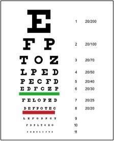
You might think that the letters in this ever-recognizable vision exam (aka a Snellen chart) were just thrown together by some random person who just so happened to like those particular letters and that particular font. WRONG!
The original chart was developed way back in the early 1860s by a Dutch ophthalmologist named Hermann Snellen and Dr. Franciscus Donders. Yes, like most exams, it was based on a very confusing looking formula:
Visual acuity (or clearness in vision) = Distance from the chart / distance at which the smallest letter identified subtends an angle of 5 arcminutes.
As you might now suspect, the font used on the Snellen chart was no accident. The blocky form of the print was developed based on the letters of the English alphabet E, C, D, F, L, N, O, P, T and Z, which have equal legibility to one another. Furthermore, if you decided to measure the letters and spacing on the chart, you’d notice that the width of each of the characters is equal to the amount of white space, and the height and width of a letter is 5 times the thickness of a line.
Optometrists today use a variation of the original chart, but it should be comforting for you to know that we’re not just throwing bold letters on a wall and asking you to read them because it’s entertaining. Decades of research have gone into perfecting the Snellen chart all in an effort to help you see your clearest and keep your eyes healthy!